


Orange heat is the fiery, high-saturation color trend defined by vivid tangerine, amber, and flame-like orange tones that have taken over interior design, fashion, and branding in 2025. Unlike a soft accent shade, orange heat is meant to be seen — it commands a room, a runway, or a homepage the moment it appears. In this guide, we break down exactly what the trend means, where it came from, how to use it correctly, and where people most often get it wrong.
Color shapes how a space feels and how a brand is remembered. However, few shades command attention quite like a well-placed burst of orange heat. Therefore, understanding how to apply this trend strategically — rather than randomly — can give your home, wardrobe, or brand a genuine visual edge over anything muted or safe.
What Is Orange Heat? Two Meanings Worth Knowing
If you landed on this page while searching for a portable infrared space heater sold under a similar name, it's worth clarifying up front: this guide is entirely about orange heat as a color and design movement, not a heating appliance. Both uses of the term are common online, so knowing the difference saves you time. If you're shopping for a physical heater, look for retailer or manufacturer product pages instead. If you're here to understand the design trend — the warm, saturated shade dominating homes, closets, and brand palettes — you're in exactly the right place.
As a design term, orange heat refers to the concentrated use of warm, flame-inspired orange hues — ranging from vivid tangerine to deep amber — as a primary visual statement rather than a subtle accent. In particular, it sits at the intersection of red's intensity and yellow's optimism, creating a tone that feels bold and inviting at the same time.
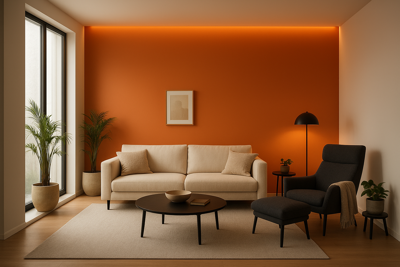
An orange heat accent wall transforms a neutral living space into a warm, energetic focal point.
Why Orange Heat Is Everywhere Right Now
According to color psychology research, orange is one of the most emotionally stimulating colors in the visible spectrum. It activates feelings of enthusiasm, warmth, and social energy. As a result, designers and brands have increasingly turned to orange heat as a tool for standing out in crowded, saturated visual environments.
The trend accelerated through post-pandemic design culture, where people craved warmth, vitality, and expressive interiors after years of muted, "safe" palettes. In practice, this meant orange moved from a sidelines accent to a center-stage statement. Similarly, the broader cultural shift toward maximalism and personal expression created fertile ground for a color this confident to thrive.
The Psychology Behind the Warmth
Color psychology explains why orange heat feels so compelling. Orange stimulates the appetite, encourages conversation, and signals creativity. Because it sits between red and yellow on the spectrum, it carries the urgency of red without the aggression, and the cheerfulness of yellow without the fragility.
Environmental psychology studies suggest that warm-toned spaces increase perceived social warmth and make people feel more connected. In addition, orange is one of the few colors that reads as both energetic and approachable — a rare combination that makes it powerful in commercial and residential settings alike. For brands, this means orange heat communicates confidence and accessibility simultaneously. For homeowners, it means a room can feel alive and welcoming rather than cold or sterile.
Quick facts about orange heat:
- Sits between red and yellow on the color wheel, borrowing energy from both.
- Recognized by color psychologists as an appetite and conversation stimulant.
- Used across interiors, fashion, branding, and digital call-to-action design.
- Pairs best with navy, cream, charcoal, forest green, and terracotta.
Bringing Orange Heat Into Your Home
Incorporating this trend into interior spaces does not require a complete overhaul. In fact, strategic placement is often more effective than full saturation. Below are practical, room-tested ways to apply orange heat at home.
- Accent walls: A single orange heat wall in a living room or bedroom creates a dramatic focal point without overwhelming the space.
- Textiles and soft furnishings: Cushions, throws, and rugs in fiery orange tones are low-commitment ways to test the trend.
- Statement furniture: An orange sofa or armchair becomes an instant conversation piece in a neutral room.
- Decorative accessories: Vases, artwork, and ceramics in orange tones add warmth without permanence.
- Kitchen and dining: Orange heat works particularly well in dining areas, where it stimulates appetite and encourages lively conversation.
For more inspiration on curating bold, cohesive color palettes in your living spaces, Bundle to Bundle offers a range of design-forward resources and product collections that complement warm color trends like this one.
Orange Heat Beyond the Living Room: Kids' Spaces and Everyday Gear
Orange heat is not limited to living rooms and boardrooms. In particular, it shows up beautifully in family and lifestyle products, where warmth and playfulness naturally belong together. For example, an orange-toned beach cruiser bike turns a daily ride into a style statement, while a kids' drum set finished in bold orange tones brings the same energetic warmth into a playroom.
Similarly, warm accent colors are showing up in everyday wardrobes for the youngest members of the family. A soft organic baby onesie in warm, sun-inspired hues brings the trend into the nursery, and a kids' organic long-sleeve tee with a bold print pairs naturally with orange heat's energetic personality. Consequently, the trend can extend from your walls to your closet without feeling disjointed.
Colors That Make Orange Heat Shine
Knowing what to pair with orange heat is just as important as choosing the shade itself. The right combination can make the color sing; the wrong one can make it clash.
Best pairings for orange heat:
- Deep navy blue — creates a high-contrast, sophisticated look.
- Warm cream or off-white — softens the intensity for a balanced feel.
- Charcoal grey — grounds the vibrancy with a modern, urban edge.
- Forest green — echoes nature and creates an earthy, organic palette.
- Rich terracotta — layers warm tones for a sun-drenched Mediterranean aesthetic.
However, avoid pairing orange heat directly with bright reds or hot pinks without a strong neutral buffer. These combinations can feel visually chaotic rather than intentionally bold. In contrast, a single neutral anchor — like cream walls or a charcoal rug — instantly makes even the boldest orange feel curated.
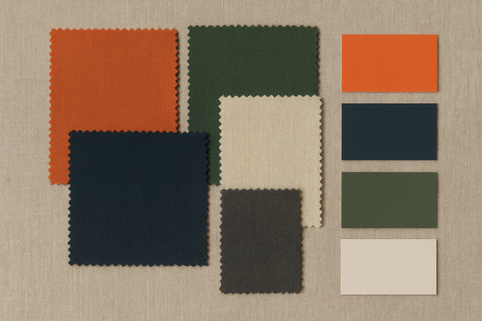
A curated mood board showing how orange heat pairs with complementary tones for a balanced, intentional palette.
How Brands Use Orange Heat to Capture Attention
In branding and marketing, orange has long been associated with energy, innovation, and friendliness. However, the orange heat trend pushes this further — using deeper, more saturated shades that feel premium rather than merely playful.
Food and beverage brands use it to stimulate appetite and convey freshness. Fitness and wellness brands use it to signal motivation and transformation. Meanwhile, tech and lifestyle brands use it to appear bold and forward-thinking without the coldness of blue-dominant palettes.
In digital design specifically, orange heat functions as a powerful call-to-action color. Because it contrasts strongly against both light and dark backgrounds, it naturally draws the eye toward buttons, links, and key interface elements. For this reason, conversion-focused web designers frequently test orange variations in A/B experiments. That said, the web accessibility guidelines on color use recommend never relying on orange alone to convey meaning — pair it with text labels or icons so the message still lands for color-blind users.
Pantone's seasonal forecasts have consistently included vibrant orange tones in recent years, reinforcing that this is not a passing micro-trend but a sustained shift in global color sensibility.
Orange Heat in Fashion and Personal Style
On the runway and in street style, orange heat has become a go-to statement. Designers have featured it in everything from structured blazers and flowing midi dresses to accessories and footwear. Meanwhile, the rise of dopamine dressing — the practice of wearing bold, mood-lifting colors — has made orange a wardrobe staple for those who want to express vitality.
For everyday wear, the easiest entry point is through accessories. An orange bag, belt, or pair of shoes can anchor an otherwise neutral outfit and inject personality without requiring a complete style overhaul. Additionally, monochromatic orange outfits — while daring — have become a high-fashion power move when executed with tonal variation, a concept closely related to the history and symbolism of the color orange itself.
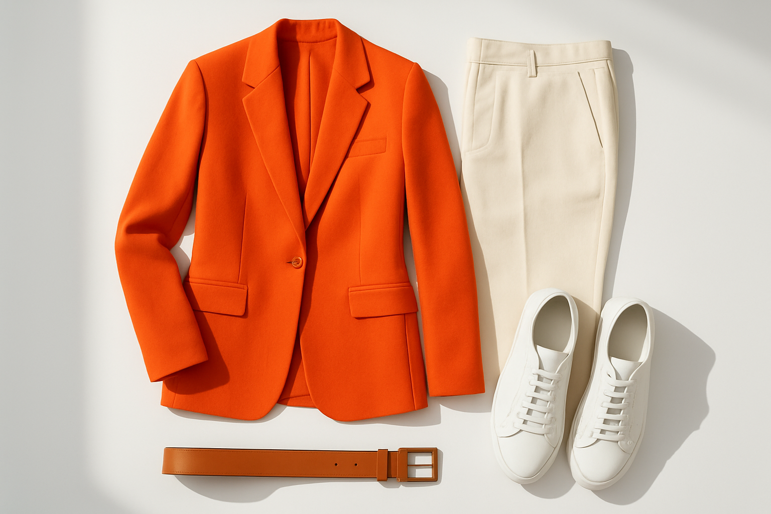
Orange heat in fashion: a statement blazer paired with neutrals for a balanced, wearable look.
How to Introduce Orange Heat Into Any Space: A 5-Step Method
If you are ready to commit, follow this simple sequence to apply orange heat with confidence rather than guesswork.
- Choose your shade and undertone first. Decide whether you want a yellow-leaning tangerine or a red-leaning amber, and stick with that undertone across every piece you add to the room.
- Start small with textiles or accessories. Introduce orange heat through a cushion, rug, or throw blanket so you can live with the intensity before committing to anything permanent.
- Test the color under your real lighting. Paint or fabric samples should be viewed under both daylight and your evening bulbs, since orange shifts dramatically between cool and warm light sources.
- Add one statement piece or an accent wall. Once you're confident in the shade, commit to a single bold element rather than spreading orange thinly across every surface in the room.
- Balance with neutral or cool tones. Finish the look with cream, charcoal, or navy elements so the orange heat reads as an intentional design choice, not an overwhelming one.
Common Mistakes That Ruin Orange Heat Designs
Even a trend this compelling can go wrong without thoughtful application. Therefore, being aware of the most common pitfalls will help you use orange heat effectively.
- Overloading the space: Using orange on every surface eliminates the contrast that makes it powerful. Balance is essential.
- Ignoring undertones: Not all oranges are the same. A yellow-leaning orange can clash with a red-leaning one, so keep undertones consistent.
- Poor lighting choices: Orange looks very different under cool fluorescent light versus warm incandescent bulbs. Always test samples in your actual lighting conditions.
- Neglecting contrast in digital use: Orange text on white backgrounds can have insufficient contrast for accessibility. Use it for accents, not body copy.
- Skipping a sample test: Committing to a full wall or garment without testing a swatch first is the single most common regret reported by first-time users of the trend.
Is Orange Heat Here to Stay?
Color trends cycle, but orange heat has the cultural and psychological foundations to maintain relevance well beyond a single season. It reflects a broader societal desire for warmth, optimism, and expressive individuality — values that are unlikely to fade quickly.
Furthermore, as sustainability and natural materials continue to influence design, earthy orange tones connect beautifully to clay, terracotta, and organic textures. This means orange heat evolves naturally alongside other dominant trends rather than competing with them. You can explore how to integrate trend-forward palettes into curated lifestyle products at Bundle to Bundle.
"Orange heat is not just a color — it is a feeling. It is the warmth of a fire, the energy of a sunrise, and the confidence of someone who knows exactly who they are."
Frequently Asked Questions About Orange Heat
What is orange heat as a color trend?
Orange heat is a bold, warm color trend defined by vivid, fiery orange tones that evoke energy, warmth, and confidence. It has dominated interiors, fashion, and branding through 2024 and 2025, emerging as one of the most expressive color movements of the decade.
What emotions does orange heat evoke?
Orange heat evokes enthusiasm, energy, warmth, and creativity. Because it sits between red and yellow on the color spectrum, it carries urgency without aggression and cheerfulness without fragility — a uniquely balanced emotional profile.
Is "orange heat" also a heater brand, not just a color?
Yes. The phrase is used both for a portable infrared heater product and for the design trend covered in this guide. If you're researching color, decor, fashion, or branding, this article addresses the orange heat design movement specifically.
How can I use orange heat in interior design?
You can introduce orange heat through accent walls, statement furniture, cushions, rugs, and decorative accessories. Pairing it with neutral tones like cream, warm white, or charcoal keeps the intensity balanced and the space feeling cohesive.
What colors pair well with orange heat?
Orange heat pairs beautifully with deep navy, forest green, warm cream, charcoal grey, and rich terracotta. For a dramatic high-contrast look, pairing it with black or midnight blue creates a striking, sophisticated visual effect.
Is orange heat suitable for branding and marketing?
Yes. Orange heat communicates energy, friendliness, and innovation — making it highly effective for food, fitness, tech, and lifestyle brands. It is also a powerful call-to-action color in digital marketing and web design.
What is the difference between orange heat and burnt orange?
Burnt orange is darker and earthier with brown undertones, while orange heat is brighter, more saturated, and leans toward vivid flame-like tones. Orange heat reads as more energetic and contemporary compared to the muted warmth of burnt orange.
How do I incorporate orange heat into fashion outfits?
Start with accessories like an orange bag, belt, or shoes to introduce the trend without committing to a full outfit. For a bolder approach, an orange blazer or dress paired with neutral basics creates a powerful, wearable statement.
Is orange heat a good color for small spaces?
In small spaces, use orange heat as an accent rather than a dominant wall color. A single piece of orange artwork, a cushion, or a small piece of furniture can introduce warmth without making the room feel enclosed.
What design styles work best with orange heat?
Orange heat complements maximalist, bohemian, mid-century modern, and contemporary eclectic styles. It also works well in industrial spaces where warm tones contrast dramatically against raw concrete or exposed brick.
Does orange heat work in digital and web design?
Orange heat is a powerful call-to-action color in web design because it draws the eye and encourages interaction. However, it should be used strategically as an accent or button color rather than a background to maintain readability and accessibility.
What are common mistakes when using orange heat in design?
Common mistakes include overloading a space with orange so it loses impact, ignoring undertone consistency, testing paint in poor lighting conditions, and using orange as body text in digital design where contrast and legibility suffer.
How does orange heat relate to Pantone color trends?
Orange heat aligns with Pantone's ongoing focus on warm, expressive hues. Several Pantone seasonal palettes in recent years have featured vibrant orange tones that mirror the energy and boldness of this trend, confirming its place in the mainstream design conversation.
Final Thoughts on Orange Heat
Orange heat is more than a fleeting color moment — it is a reflection of a cultural shift toward warmth, expressiveness, and bold individuality. Whether you apply it to a single accent wall, a brand identity, or a statement outfit, this trend rewards those who approach it with intention and confidence.
Because orange heat is both psychologically powerful and visually versatile, it offers something rare in design: a color that feels equally at home in a luxury interior, a high-energy brand campaign, and an everyday wardrobe. Used thoughtfully, it does not just add color — it adds life.


